
Do not adjust your set – Clare Gadsby – @clare_pistache (Instagram) – 25th September 2020
Over the past week I’ve been re-flirting with intentional camera movement (icm). I like how this technique brings movement, life and energy to my photographic images, often making me view my subjects in a different, unique and creative way.
For this effect I choose a small aperture (this means a larger f-stop) and very low ISO to give me a slow shutter speed. It’s easier to try it out on a dark, overcast day than in full summer sunshine. Then I move the camera, up and down, side to side, round and round, and see what happens … There might be lots of blur, a little blur, no blur at all, and it’s at these times that I’m grateful for the digital era, as many of my images are deleted when I’m playing with icm. But, as so often with creative exercises, the journey is a huge part of the fun. Sometimes I want the original subject to be identifiable, such as a garden scene, or a macro capture of a flower. Sometimes I’ll go full abstract and lose any hint of what I was originally looking at. Sometimes I use a blur filter in Photoshop to create this effect, which can be very pleasing, and has none of the hit and miss quality of in-camera icm, but there’s something very satisfying about standing there and capturing it in the moment.
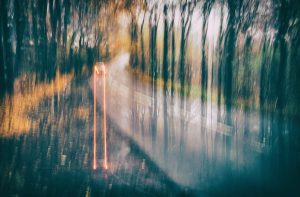
Here’s a rainy autumnal day on a Cotswolds lane, where I stood in the wet waiting for a car to approach, as you do when you’re a photographer:
Sitting above Bronte beach near Sydney, Australia, watching people walking down to the water:

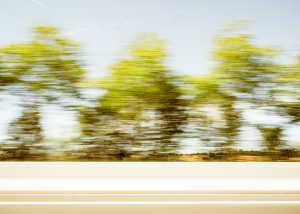
If you’re lucky enough to have a chauffeur (Mr G) driving up France you can use the same camera settings mentioned above, and the speed at which you’re whizzing along will provide the icm effect (the foreground is the motorway crash barrier):
And this week’s inspiration came from the garden:

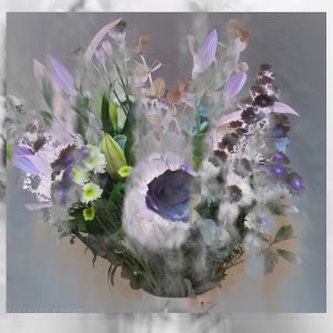
And a bouquet of flowers sent by my lovely sons. Here I converted the icm image to black and white, took it into Photoshop, duplicated the original and played around with the blend modes, which brought me to this unexpected final picture:
Working With Chalk Pastel Pencils – Paula Kear – (PaulaKearArt) – 9th November 2020
I am no expert but pastel pencils have always been my medium of choice, so I thought I’d share some of my observations…
- I use pastel paper which has a texture on one side. This type of paper holds the chalk really well and gives an added dimension to the picture. It’s great for fur and hair!
- Consider the paper colour and what effect it will make to the finished colour of the pastel on top of it. Lighter paper may make the pastel insipid and may change the hue. Be prepared for darker colours (especially black!) to dull the colour. This process might take a few hours to happen.
- Also remember that different pressure with the pencil on the paper can alter the colour. e.g. lighter pressure of red will turn into brown on black paper. Sometimes it’s trial and error!
- You don’t need a whole raft of coloured pastel pencils. The different pressures used with one colour will give so many different shades with practise. You will be pleasantly surprised! Usually pastel pencils cost from £1.40 so it is a fairly cheap medium to work with and there’s no mess apart from a little chalk dust!
- It’s worth bearing in mind that different makes of pastel offer a variety of ‘hardness’ even with chalk. For example Caran D’Ache is a higher quality pencil with a colour which stays true, is very soft and a little waxy. CarbOthello is cheaper and is slightly harder and therefore longer-lasting. With certain paper/colour combinations it can fade. For these reasons I use both!
- If you are careful you can put one colour on top of another. But if too much pastel is applied you may end up with a sludge brown colour which you can do nothing with, other than to rub it out and start again (I liken this to mixing up different coloured plasticine!)
- In my experience a fine mist of fixative is necessary to do just that. It won’t change the colours if you use it sparingly. I then leave the portrait to dry overnight.
- I prefer to use a scalpel to sharpen my pencils to get the fine point that I need for detailed drawing.
- I tend to smudge with my finger, because I find that I have more control, and personally I find it easier than using cotton buds, eye make-up sponges etc. But they’re worth a try.
- Don’t be afraid to experiment with colour, texture, pressure, detail and smudging. It’s the best way to discover just how flexible chalk pastel pencils are!
- Occasionally I have found that it’s easier to add bright white highlight towards the end of the drawing as the brightness can dull/change with any darker chalk dust that might accidently drift.
- To enable me to be more precise when I need to rub out a very tiny area I use a Tombow 2.3mm round tip MONO zero refillable eraser.
- You don’t need an artist’s studio and all the expensive equipment to go-with to produce art! I work next to a window in my spare bedroom, drawing on a piece of MDF board angled against a chest of drawers and me! My pencils are laid out on a chair next to me.
It’s good just to have a go, whatever medium you choose, even if you’ve never tried creating art before. You will hopefully find that you enjoy it. It can also boost your mental health too. I put my favourite music on and any stress and worries disappear whilst I draw. And I’m practising mindfulness without even realising it!
As artists we all work differently but we all share a great passion for art 😊.
If you wish to discuss further or you have additional hints and tips to share, please email me at Paula@PaulaKearArt.co.uk. I’m also on Facebook and Instagram.


Get updates about our next exhibitions
We will process the personal data you have supplied in accordance with our privacy policy.